Design Inspiration: 10 Liquor Bottle Designs That Go Down Smooth


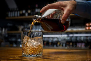
The nightcap experience is a feast for the senses. But to sell more of your herbaceous liquors, the label design must be a feast for the eyes. You’ve only got one shot at making a good first impression before customers can taste your spirit.
A memorable name isn’t enough for a craft distiller. You need a custom liquor bottle label with an irresistible design that makes customers grab that bottle and dash to the checkout counter.
Great Design is a Must for the Liquor Industry
What’s in a great design?
It’s difficult to pinpoint what goes into a standout liquor bottle label. One thing is clear: the heart of a great design is a delicate three-way dance between the bottle, the brand, and the label itself.
While the alcohol inside the bottle may very well be exceptionally delicious, new customers won’t know if the container holding it is meh. Good alcohol and good design are not mutually exclusive.
The bottom line is that tastefully exquisite alcohol is what retains your customers. But the design is what sells the product in the first place.
Take these alcohol sales stats for example:
- Roughly 27% of consumers purchase alcoholic drinks based on the labels alone
- Appealing, descriptive label designs influence 31% of consumers to buy
- Up to 30% of consumers want to see familiar terms and descriptors on beer labels
And the biggest one?
Forty-three percent of liquor drinkers go for the same brand over and over again. So, if your label and bottle design get them to try your liquor, almost half of your samplers will become repeat customers.
So, grab your whiskey tumbler, pour a drink, and start scrolling for your custom-designed liquor bottle inspiration.

1. A KISS of Text
If you’re a keep-it-simple Simon kind of person, consider using just text to grab attention and convey your brand personality.
In this example from R&R, we’ve got the whiskey's deep, rich amber color doing most of the eye-catching.
The swooping text and strong font are an old-school, creative way of further conveying the product’s unique selling points and other important information. Then, you’ve got the coat of arms and the logo. Add in the flowers molded into the bottle, and you have a product that screams “elegant.”
This style of branding is common with top-shelf or “reserve” liquors. If your goal is to sell customers on the product's age or prestige, you can’t go wrong with a minimalist design emphasizing the color of your spirits over the brand itself.

2. Set the Scene with Contrasting Colors
This beautiful tequila label from Mijenta uses just two colors to create an eye-catching label. Cool, contrasting colors formed into a tranquil nature scene relate to the concept of smoothness. This isn’t a harsh tequila with a face-twisting bite; this is a mature sipping tequila. The brilliance of Mijenta (and well-designed labels in general) is that you don’t need to taste it to understand who it is for.
Paint a picture on your bottle’s label. Use colors that play off each other. But most importantly, use your label design to relate what kind of experience customers are in for. Make the flavor and the feeling of your spirit apparent in your art, and the sales will follow.

3. Silvery tri-tones
When it comes to colors, what’s better than two? Three.
This bottle from The Dalmore uses primarily gray and green tones to contrast against the amber liquor. However, there is a third color. The edges have a metallic silver to them, and the silver deer’s head reinforces this in the center, adorning the bottle like an elegant necklace.
Like the previous bottles, this design uses unique elements to elevate the overall tone and branding. The reflective silver label makes a statement about the quality and age of the product. If you want to enhance an existing design, you can’t go wrong with silver and metallic highlights.

4. Knock on Profit Heaven’s Door with Trippy Silhouettes
These bottles from Heaven’s Door are some of our favorite whiskey labels. We showed you what can happen when contrasting two colors, but what happens if you use the liquor itself for contrast? You get a memorable, standout design.
It’s rare for brands to use silhouettes in label design. But for a colorful product like an amber whiskey, it works. A lot is going on in the design, and the longer you look, the more you see. That’s because the label covers the entire height of the bottle; it creates visual contrast and action that pulls the eye in and gives customers something to look at and inspect.
The key takeaway is doing less with more and maximizing the real estate on your bottle first to capture attention and then tell your brand story.

5. A Vintage Vieux Carré Worthy of Your Customer’s Cart
Here’s another custom liquor bottle label from Cooperstown Distillery that lets the color of the spirit do most of the talking. But the label itself is also a heavy-hitter. We love the contrasting deep navy shade of the label background against the warm amber liquor inside. The logo itself is also a Victorian-inspired masterpiece.
You can’t go wrong with vintage fonts and images for an always-classic liquor like whiskey. Many small distilleries go for images evoking Industrial Revolution Americana or the Wild West. They do that because it works; it’s eye-catching, it is a means of visually coding quality, and it inspires confidence in the brand.

6. Don’t Shy Away From Color
Looking at the last few designs (or even walking down the aisles at your local liquor store) you might notice that liquor bottle labels tend to use one or two colors, usually complimentary warm and cool hues. Typically, wine bottles and craft beers have more vibrant, colorful designs. But maybe your brand isn’t like the others; your spirits are more lively and energetic. Perhaps they’re meant for loud parties, not sipping and cigars. In that case, you should explore the full spectrum of color.
Sometimes, standing out means looking at what your competitors are doing and going in the opposite direction. If your competitors are all using two-color labels or don’t have exciting art, fill in that niche and make something that turns the heads of anyone passing by. If it makes sense for your brand, go big and bold and go for as many colors as you need to tell your story.

7. Tell Your Story With a Label
As a general rule of thumb, visuals that convey what the person will get once they finally sip your liquor will be more enticing than text.
This is why most brands use their logo, brand name, mascot, or other pictorial imagery to sell their products. Assets like these make your brand more appealing to new customers and stand out from the shelf-lined competition. Despite this, most liquor branding is straightforward, like the text-based labels above.
For new brands and craft distilleries, however, we recommend using pictorial elements as the star players in your custom-designed label. Legacy brands with an established tenure often use their name as the most eye-catching element. But that doesn’t work so well for smaller or newer brands.
Take a look at these flavored whiskeys from Jim Beam, for example. Maple, Honey, and Fire all use suggestive imagery, giving you a conceptual idea of the flavor. The maple has that viscous, thick syrup design running down the sides; you can almost taste the sweetness. The honeycomb is bright with crisp lines.
Compare those to the Red Stag on the left. The flavor is unclear if you aren’t familiar with the product already. It has a stand-out brand name, but the design doesn’t tell you what’s going on inside the bottle.

8. What’s in a Name? A Rare Liquor that Grabs Attention
Are you selling a rare or unique liquor or one with a reputation that precedes it? Something like an Absinthe, a Krupnik, or a Mezcal? Then go big and bold with how you design the name. Use the name as the key element in your label to get your target customer’s attention. This way, you’ll grab the attention of those who already know what it is and stand out to those who don’t.
When you have a rare liquor, there is one more thing to consider: The pitch. Your average customer probably knows the difference between an American whiskey and a scotch. They probably won’t know what to expect from a Krupnik. For that reason, makers of uncommon spirits should provide a brief description on the front of the bottle to educate customers and help them understand why they should sample a liquor and a brand they’ve never heard of.

9. The Collectible Factor
We can’t just talk about unique liquor bottle labels without mentioning the containers they adorn, especially when it comes to this example from Von Payne.
As you can see, the label, bottle shape, stopper, and liquid inside complement each other, pulling together into an exquisite display of vampy goodness. These bottles are almost always on backorder because of the design alone. Customers collect these as a conversation piece.
If you’re thinking about turning your label and bottle shape into a unique design, use this example for inspiration. All elements of the liquor bottle are themed and branded. You can turn your unique liquor bottles and labels into a collectible series if you do something similar. This will give you additional marketing opportunities for your brand.

10. Geometric Beauty
It’s your brand, and you should do what you want with it. And if you want to flex your creative muscle and knowledge of historical art movements, then shine on.
In this example from Meranda, a brooding black background meets shimmering metallic gold, which races across the label in Art Deco-inspired geometric patterns. This is another label where customers can get lost in the details, looking over every line and hidden design. Get inspired with this design and let your liquor bottle become the piece de resistance of your brand.
Stand Out on Shelves With Custom Liquor Bottle Labels
So, what will it be?
Bold colors, metallic shimmers, text that swoops and swirls, or something else entirely? Your design choices for custom liquor bottle labels are endless. While every brand does it differently, you should consider how these design elements come together and what they say about the brand.
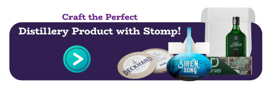
When you have a design in mind, Stomp is here to bring it to life. At Stomp, our nifty design tool and instant proofing process make it easy to design the perfect label for your distillery. Our experienced design team is always here to help if you ever need assistance.
- Nashira Edmiston