Guide: Design Tips to Spice Up Your Hot Sauce Labels

You put a lot of work into your hot sauce. You carefully evaluated the ingredients – not too much vinegar, not too little spice. With a time-tested recipe, you’re confident that everything inside your bottle is up to par.
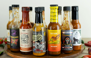
Then a customer comes along, takes a two-second gander at your product, and decides to opt for your competitor’s hot sauce with the flaming skull on the label.
Argh! Unfortunately, too many people judge books by their cover — or in this case, hot sauces by their labels. But there’s good news, too. It’s not hard to spice up your hot sauce labels. With the right inspiration and a design trick or two, you can convince customers that what’s inside the bottle reflects the quality of what’s outside the bottle.

Here are some design tips to get your label just as caliente as what’s going on inside the bottle:
What Does Your Branding Say About the Sauce?
You know that old phrase “a picture is worth a thousand words?” Well, the same logic holds up for hot sauce labels. You can paste the words “delicious” and “spicy” on your label all you want. But if the brand positioning of the label’s design doesn’t evoke those qualities, customers will give you a hard pass.
Why’s that? Because in the world of hot sauce labels, customers’ perceptions rely on some tried-and-true principles:
Craft hot sauce is an extremely competitive space. To succeed, you need to design both your sauce and brand for a particular kind of hot sauce enthusiast. Reflect your choice in the label design. You wouldn’t add a label full of peppers, spices, and whole ingredients if you wanted to communicate raw heat.
Similarly, a skull and crossbones on a hot sauce meant for chili con carne cookoffs might send the wrong message.
It only takes potential customers one glance to guess whether your hot sauce is for them. Before you do anything else, make sure your label fits the message you want to send.
Design Tips for Hot Sauce Labels
Once you’ve settled on brand positioning (are you targeting heat-seekers or taste-seekers?), it’s time to design your label. But it doesn’t happen in one fell swoop. Here are some specific tips for making sure your labels reflect what’s inside the bottle.
Tip #1 Get Specific About What’s in Your Hot Sauce

Ever open a bottle of hot sauce with no idea what’s in it? Of course not. We in the western world read detailed labels. Ingredients, calorie counts — they all help us understand what we’re putting into our bodies. But with hot sauce, you’ll want to make sure your label covers everything customers expect from a spicy product. For example, the label above says “Tongue Torch,” and matches the fiery imagery. There’s no confusion about what that means.
To keep clear about what’s inside the bottle, make sure your label includes the following:
What does it look like when you put it all together? Consider this label below:
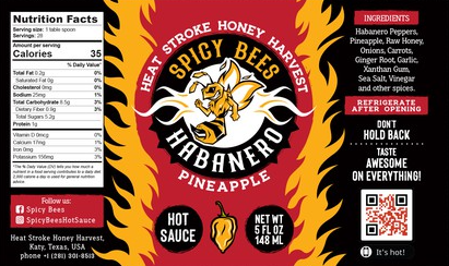
Contrasting colors. A bee mascot. The intimation of flames. Nutrition information. Mottos. This is a hot sauce label that has it all — a description of the sauce, its flavors, and the full use of the label as a canvas. Integrate every element here and you’ll strike a chord with your audience.
Tip #2: Pick the Right Colors
Red hot sauce, red label. Make sense? Not as much as you’d think. We human beings don’t tend to notice products that blend into the background. You want high-contrasting colors to make your hot sauce as noticeable as possible. This will also help the design of your bottle “pop.”
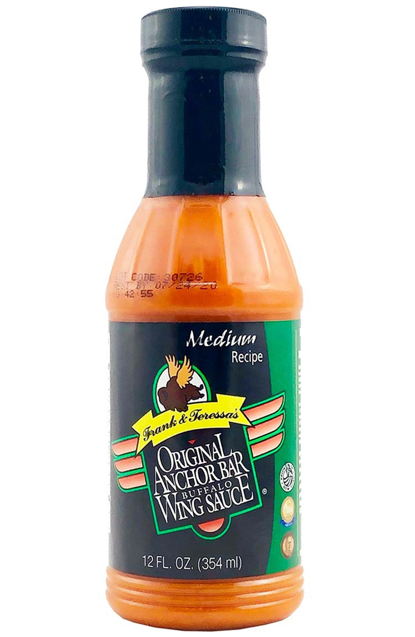
Take the traditional wing sauce above. The black label contrasts with the orange sauce, as does the green. If it were all orange and red, how much would it really stand out?
Studies show that the context of colors will affect how you perceive them. You might not think it’s a powerful effect, but consider this: if color contrasting didn’t play tricks on our minds, these color-contrast illusions would not be possible.
Not sure this has an impact on how people perceive your product? Think again. Canva’s list of color breakdowns by industry shows just how much companies tend to stick to colors they know work. And from that, there’s one thing hot sauce brands should recognize: In the food industry, red and blue tend to dominate, especially amongst fast food chains.
With hot sauce, red is another great choice for labels, so long as it doesn’t get lost in the reddish-orange tint of the sauce itself. To stand out, you can still use reds on your custom hot sauce labels. Just remember to use other high-contrasting colors (like black or green) which aren’t too close to red on the color spectrum. If you’re not sure what a high-contrast color is, you can use Canva’s color wheel to view color opposites.
Also, remember that dark red sauces, especially those with visible pepper flakes, signal higher heat levels. While it's tempting to contrast a really dark – almost brown – sauce with lighter colors, you need to ask yourself whether that design will appeal to heat seekers or taste seekers.

Tip #3: Be Selective with Your Font
Don’t think font matters? Imagine how much credibility this article would carry if we wrote it in Comic Sans.
It would look silly. And justifiably so. The readability and style of font should reflect what you want to accomplish with your messaging.
The trouble here? There are so many fonts to choose from. How can you possibly know whether Font 1 or Font 2 Bold is going to be the best choice for your brand?
To make sense of it, let’s go back to the two basic breakdowns of hot sauce customers: heat-seekers and taste-seekers. We’ll look at another label to show you a font you can use to appeal to taste-seekers:
Notice how “Lime” is in cursive? There’s a reason for that: the keyword homemade. This label has a rustic, southwest charm to it. More generally speaking, cursive fonts tend to reflect that homemade quality the robotic fonts don’t.
Similarly, you want to avoid fonts that contrast with the message you’re trying to send. An extreme (if somewhat obvious) example is using a font with icicles dangling from the letters while trying to sell a hot sauce. That won’t work.
But not every font choice is so obvious. To aid you in your choices, let’s look at some font design principles you can stick to:
- For a “homemade” look, use fonts that mimic handwriting or arts and crafts. “Painted” fonts will work, as does the cursive font from our example. These are typically from the Decorative family of fonts.
- For your official information, use straightforward, readable fonts. Serif and Sans-Serif family fonts tend to be the best here.
- Use the art of contrast to emphasize some words over others. For example, have you ever noticed that publishers will emphasize an author’s name — but only when that author has a reputation as a bestseller? They’re putting their most important quality in the biggest font. You can do the same. A well-established brand can put its name in big letters, true. But if you’re new to the hot sauce game, you might consider emphasizing other words. Remember to use some contrast in font sizes. Otherwise, your labels will feel stale and even boring.
- Consider hue, saturation, and value. Hue is the color choice — you can read all about that in the previous section. Saturation deals with how vivid this color is. The less saturation, the more the color “blends” with the background. And value is the overall darkness or lightness of the color — again, you want to check for contrast against the background.
Tip #4: Select Attention-Grabbing Graphics
You can do all of the above and still feel like you’re missing one critical element. And you may well be, especially in the world of hot sauce labels. We’re talking about graphics.
The beauty of using custom hot sauce labels is you can use custom die cut labels to match the labels’ cut to your designs. This frees you up to choose anything as your graphics.
The question: what should you choose? Let’s break it down again:
How Stomp Can Spice Up Your Custom Hot Sauce Labels
Stick to the principles above and you’ll craft custom hot sauce labels that fit your brand, fit your target market, and stand out from the crowd. But design is only half the battle, you also need to print the labels and ensure they are high quality.
We happen to know someone who can help with that.
If you’re ready to start printing your own labels, now’s the time! Check out our custom hot sauce labels to turn the heat up on the competition. (Sorry. We had to say it.)
- Nashira Edmiston