Presentation is Everything: How to Make Your Bakery Stand Out


Whether you’ve just opened your first bakery or you’ve been around for a half-century, it’s always a good idea to regularly revisit your branding, label design, packaging, and marketing to ensure your tasty treats continue to satisfy the cravings in your community.
Presentation is supremely important in the world of food and baking. It’s important to translate the mouth-watering experience of your bakery creations into a custom-printed label, sticker, or box design. You want a brand design that invites the customer to try your baked goods. In this post, we will be talking about the importance of presentation, how to make your bakery stand out, and some of the most well-known bakery brands to help spur some creative inspiration.

How to Make Your Bakery Stand Out: Tell the “Hole” Story
Hundreds of thousands of bakeries operate in the U.S. and generate billions of dollars in revenue. In such a competitive market, how does a bakery stand out from the crowd? A few ways to stand out include:
- Dare to be Bold
- Go with a Classic Design
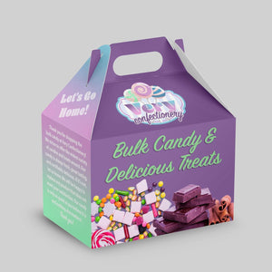
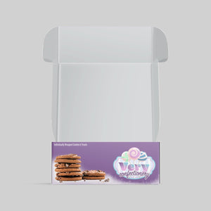
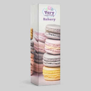
- Be Unique with Clear Packaging
- Use Easy-to-Read Font
- Create a Solid Brand Image and Voice
- Use Graphics or Brand Logos
- Identify a Distinguishable Color and Style
- Be Consistent
When we’re talking branding basics, it all goes back to your bakery’s identity. Every aspect of your marketing: labels, stickers, box design, packaging, etc., is born from the story and what makes your bakery unique. What is the story and energy of your bakery?
If this is the first time you’ve been asked these questions, don’t worry. Creating a packing design should reflect your bakery’s story, character, and personality. If you have more of a country, rustic vibe, then your branding identity should reflect that aspect. If you are edgy and modern, then think about branding designs that use contemporary graphics that pop.
When thinking about your story and brand identity, make sure that it feels authentic to your bakery’s personality in addition to practical matters such as easy-to-read fonts!
Consider this a crash course in branding and marketing that will help you level up in your industry. We’ve included some examples below for inspiration on the many ways your brand personality can go.
Dare to Be Bold: Can You Taboo?
Basically, you want everyone who walks through your doors to be immersed in the experience of the story you create around your bakery; from the storefront to the interior, the display case, the presentation of the baked goods in question, their packaging and labels, the first bite, and, for brownie points, even beyond that! Choosing a brightly-colored bakery packaging design can help consumers identify your brand.

You may be familiar with VooDoo Doughnut, the bright, charismatic, yet playful, weird, and a little taboo doughnut provocateur based out of Portland, OR. VooDoo Doughnut’s story is a compelling one, riddled with experimentation, infused with the vibe of the local culture, and unparalleled baked good boldness that successfully and artfully challenges the status quo. As you can see, they are clearly known for their pink boxes, to which they make note in their tagline: “Good things come in pink boxes.”
They went with a packing design that a customer can clearly spot from yards away with a bold color choice and designed gothic-style characters that stand out. VooDoo Doughnut’s brightly-colored packing design is clearly working- they recently opened their eleventh location in Orlando, FL. Take some notes from VooDoo Doughnut and dare to be different with your bakery packaging design.
Go With A Classic Design: Donut Discount the Classics
If your bakery personality isn’t about bold colors and gothic drawings, then think about going classic with your design. To offer some contrast, check out how different the branding and story for Krispy Kreme is from VooDoo Doughnut. Yes, they each have a two-word name but their personalities are wildly different.

Krispy Kreme, founded in 1937, capitalizes on their iconic, almost century-old brand with a very classic, clean, polka-dotted, family-friendly personality with typography that perfectly encapsulates the time of its inception. In today’s world, the classic design brings a sense of nostalgia of the old days. Anyone can recognize their brand even without seeing the name.
For your bakery, your packaging label can be a clean and classic design yet be unforgettable that consumers will spot anywhere.
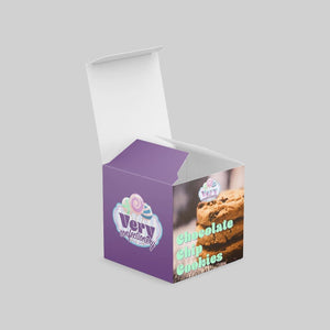
Clearly Delicious: Bundt Wait, There’s More!

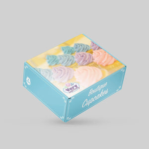
The previous two examples focused on two very different styles: big and bold versus simple and classic. Both are very effective with their design and color choices. Another effective bakery packaging design example is by Nothing Bundt Cakes, who chose a whimsical logo and a clear-packaging design.
Nothing Bundt Cakes’ label design debuts a polished, sophisticated brand with a logo design using cursive typography that, without a doubt, is highly appealing to their target market. It feels whimsical and fun. Also, they included a flower in their logo design, which closely resembles their bundt cakes and icing designs. Their clear plastic packaging with their logo sticker makes it obvious that it's one of their cakes. Plus, another consumer can “see” the bakery product and may be convinced of how delicious it looks through the packaging to go buy their own. Having a window or clear bakery packaging design may help consumers to identify your product immediately.
While it’s obvious that Nothing Bundt Cakes kills it in the sweet-tooth business, they’re not too shabby when it comes to humor, either. There is endless potential when it comes to customized labeling for this brand and we are swooning over all the puns just waiting to be pulled from the air and printed for special occasions.
More Than Mouth Pleasure
No matter the type of baked treats you serve to your community: savory, sweet, or everything in between, you get to create the story that entices folks into your shop. It can be as fun and off-the-wall or traditional and comforting as you want it to be!
Make sure your bakery packaging design:
- Reflects your personality
- Use font that Is easy to read
- Has distinguishable color and style
- Links to the bakery brand identity
What’s important is that every aspect of the story gets infused into not just your goodies, but in the comprehensive presentation of it: your storefront, interior, display case, labels, stickers, packaging, napkins, and more. The more details you hide in every aspect of the experience, the more there is for your hungry customers to keep discovering about your bakery, not to mention keep them coming back for more!
Roll Out with Stomp
Designing the right labeling and packaging designs will be super important to distinguishing your bakery from the dozen. You want people to return to your bakery for the tasty sweet treats. What better way to promote your brand than having a distinguishable and unique logo and packaging design? Customers are literally walking advertisements if you have the right branding.
Now that you’ve had a crash course in branding and marketing, it’s time to get designing! At Stomp Stickers, we specialize in custom stickers, labels, and boxes to help your brand stand out. Be sure to check out our super nifty design tool, making designing your marketing materials a breeze with the added perk of support from our team. Have any more questions? Contact our printing experts today. We can’t wait to see what you come up with!
- Marketing Team