The Power of Color: 7 Key Considerations for Using Color on Custom Packaging


As a consumer, you may not think much about color when it comes to the products you buy. But as a product designer, if color isn’t one of your “primary” concerns, then you’re missing out on a crucial element of successful custom product packaging design.
Color is one of the most important aspects of any design. But why? Let’s take a quick look at color theory and seven key considerations for using color on your next packaging design.
Color Theory: The Psychology of Color
Remember how Skittles told us to “taste the rainbow”? While it may not be physically possible to actually taste those colors, we as human beings have definite feelings and moods we strongly associate with different hues.
Color theory in marketing centers on the fine art of using the right shades and combinations of colors to instill certain feelings or vibes around a business, a brand, or a product. Why is candy and its packaging brightly colored? Because consumers often perceive those bold shades as fun and exciting.
The Emotions of Color

It’s probably been a minute since you’ve seen or even thought about the color wheel you learned about in elementary school. Back then you probably learned about primary colors and how red and blue make purple.
Chances are pretty good your teacher didn’t dive into the world of emotion and perception inside of colors and their multitude of shades. So, let’s look at color again, this time with our marketing caps on:
- Black: Black is a dark, heavy color, with an air of both power and class. High-end luxury brands often rely on black to carry that whiff of sophistication on their packaging. Black is often the text color on packaging because it sits so well against other colors, making that text easy to read.
- Blue: A strong and calming color, blue is peaceful and dependable. There’s a reason conservative business brands often rely on dark blue. Those darker shades denote seriousness and reliability.
- Purple: Fruitier shades of purple work well on product packaging for foods with grapes, blueberries or other deeply-toned berries. Outside of food packaging, darker purples are also associated with luxury, even outright royalty. Lighter shades, like lavender, sit well on products that are more quietly sophisticated, or on baby products.
- Pink: You don’t get much happier or more bubbly than pink. It’s a color associated with femininity, youth, and positivity. Think bubblegum and summer dresses. Cooler shades of pink can also be soft and soothing.
- Red Intense, forceful, and full of energy, red is used in the fast-food industry to stimulate the appetite. Certain shades of red can, like black, convey a sense of luxury and expense, but in a far flashier fashion.
- Orange: Orange conveys a sense of freshness in a brand by making products seem bright and new. While some shades of orange can be seen as expensive, it has such a friendly feel that it’s become a workhorse in the more affordably priced markets.
- Yellow: Fun fact: human brains process yellow before any other color. This is why it’s used on warning signs. Aside from “Caution: Wet Floor,” yellow is a clear, warm, and happy color. Many kitchens are painted yellow because it wakes you up without being jarring. Packaging that incorporates a lot of yellow in its design often represents a very welcoming and friendly brand.
- Green: This is the color of growing things, of nature and natural materials. For that reason, green is used by brands in a variety of industries that want a feel of freshness and vitality around their products. Deeper shades of green denote luxury as well.
- White: Minimalist custom packaging designs rely heavily on the power of negative space, or open areas, to create a balance between simplicity and power. Like black, white is also a popular color for text on packaging, standing out especially well from heavier, deeper shades of color.
How to Balance Your Brand’s Vibe
It’s important to understand how colors can be brought into balance since it’s pretty unlikely that you’ll use a single shade for the entirety of your package design. Going back to the color wheel, there are a few fairly no-fail ways to choose colors that work well together.
- Triangle: This method imposes a triangle over the color wheel, using the colors at each tip. You get two complimentary colors and an opposite, balancing color. Together, these colors work well.
- Complimentary: Choosing two or three colors on the same arc of the color wheel yields colors that work together to create a strong single word or vibe (rugged, reliable, soothing, etc.) for consumers to associate with your packaging.
- Monochrome: Think monochrome means black and white? Think again. Monochrome color designs explore the depth of shades each color holds. From warm to cool, every color has its own little color wheel inside of it. You can create an impactful visual message without ever moving beyond a single color.
7 Key Considerations for Using Color on Custom Packaging
Now that we’ve got a basic understanding of color theory and how to use it, here are a few key things to keep in mind when creating your next custom design.
1. Understand Your Brand
If your brand story revolves around luxury and sophistication, you probably don’t want neon colors. Every product and the packaging it comes in must reflect your brand. After all, each package may be the first time someone encounters your brand. You want to give them the right sense of what it’s all about.
2. Understand Your Audience
Different audiences interpret colors a little differently, and you’ll need to factor in your target consumers’ color associations when you create your design. For example, colors associated with death and mourning can vary from culture to culture and so can ideas of which colors are the most luxurious.
3. Identify How Your Product Makes People Feel
The colors you use for each custom packaging design need to work with your brand, your audience – and your product. Do you want customers to feel happy and positive when they purchase your product, or should they feel relieved and confident that your product will get the job done?

Incorporating color theory may feel like a lot of moving parts, but if you stay focused on your consumers and how you want them to feel, you avoid the risk of becoming overwhelmed.
4. Research Your Industry, Niche and Competition
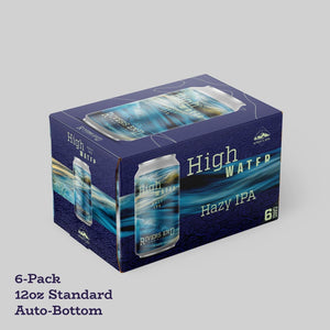
How are products packaged in your industry? If you sell beverages, then beverage carriers will be a standard part of your packaging. Take the time to research your industry, specific niche, and brands within that niche. You want to ask:
- How are products displayed?
- What are common color themes?
- How do your closest competitors visually represent themselves?
You want to fit the market, while also standing out from the competition. The right colors will do that.
5. Understand the Psychology of Food Colors
If you sell edible products, then your understanding and use of color theory will differ somewhat. Edible products often use colors associated with the way their products taste – oranges for citrus; purples, reds, and blues for berries; pinks and yellows for tropical fruits.

While this isn’t a must, you may find your customer base expects to eat with their eyes when it comes to your product packaging.
6. Play with Shades
As mentioned above, monochrome means working inside the shades of a single color.

Monochromatic packaging designs can really stand out. But even if you don’t stick to a single color, explore different shades of the colors you want to use until you get the right “feel” for your packaging, one that reflects both your brand and customer perceptions of your products.
7. Don’t Let Your Colors Fade
While plenty of brands take a set it and forget it approach to product packaging – especially older, well-established brands – an old color scheme can feel stale. It doesn’t hurt to play with different colors, shades, and pairings on your packaging designs. This can maintain a sense of freshness and relevance around your brand. Try seasonal designs as well.

Make Your Colors Pack a Punch
Adapting color theory into your custom packaging design elevates your products and your brand. The right colors snag the attention of your target customers before they even get close enough to read the text.
Create your own unique custom product packaging with colors that pack a punch using Stomp’s easy-peasy design tool. We’ve got quick-grab templates to help you get started and a super simple instant ordering process. We even save your designs so you can tweak your colors and reorder whenever you need to. With Stomp in your corner, your colors can’t help but shine.

- Marketing Team