What Are the Best Fonts for Labels?


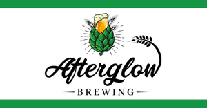
You finally have it: the perfect logo. You’ve put in countless hours into tweaking every color and perfecting every line. But there’s still one choice that threatens to make-or-break everything:
The font.
A font can be a tricky thing. It needs to be eye-catching, but legible. Your eyes shouldn’t glaze over it, but it shouldn’t distract. It needs to be readable at a glance—but still pop. If it feels like a high-wire juggling act, that’s because it is.
And it’s worth getting it right! Font psychology finds that everything from letter spacing to letter shape affects customer perception of your brand. If you nail it, you’ll have an iconic logo. And you can keep using that logo time and time again to make more sales. (After all, how much does Coca-Cola love that initial investment they made into their signature “cursive” font?)

What Are the Best Fonts?
Choosing the right font is both a science and an art, and it requires a healthy balance of both. Some of the best fonts to use for labels include:
- Georgia
- Garamond
- Open Sans
- Helvetica
- Arial
- Futura
- Calibri
- Tahoma
- Verdana
- Roboto
- Garamond
- Cambria
- Times New Roman
- Gill Sans
Keep reading to explore how you can pick the font that makes sense for the kind of customers you want to attract.
What Makes a Font “Readable”?
The best fonts for labels have to be easy to read, or else there’s not much point. So, let’s dive into the elements of a readable font:
Contrast
Is the font contrasting enough with the surrounding elements to stand out? For example, if you have a hot sauce label with fiery graphics, you probably don’t want your font to be fire-themed as well because it will blend into the background.
Spacing between letters
Too little? Too much? It can be difficult to figure out without some tweaking. If you have a round bottle, your spacing should be tighter so that the most essential information is fully visible from the front. It’s wise to experiment; try a few iterations until you choose the spacing that works best for your label—too tight and it’s hard to read, too loose and it looks overly grandiose.
Distinction
Many fonts use the same shape for different letters. Depending on the font, one, lowercase L, and capital I can all look like the same symbol. To avoid confusion, it’s often wise to use distinct fonts with entirely unique characters.
Using dyslexic-friendly fonts
Typically, less “crowded” fonts are the most accessible. Sans serif fonts, like Arial, are widely used for this reason—as are Verdana, Calibri, and Century Gothic. That doesn’t mean you can’t be creative with your brand font, only that reader-friendly fonts are helpful for smaller print, like ingredients, descriptions, and disclosures.
What Are the Most Legible Fonts for Labels?
Once you have an idea of what you want your font to look like, it’s time to narrow it down. Let’s get specific with some of the most popular, legible font choices and explore the positives of each. Remember, you should be creative when it comes to your brand logo and font. It’s only the smaller, granular text areas that should always be in more legible fonts. When it comes to strong branding, every choice counts!

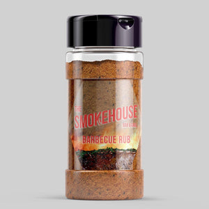
Georgia. Georgia is a type of sans serif font that has a “classic” look to it—use all capital letters and it already reads like a label. It’s especially good at evoking that sense of “classic” flavor. The bolder you go, the more confident it looks.

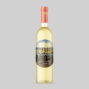
Garamond. Garamond is popular in printing books, a fact that attests to its basic readability. It’s also light, a little on the thin side, with plenty of empty space. It’s generally better for an elegant touch, which is excellent if you sell a premium product or want to emphasize the upscale nature of your offerings.

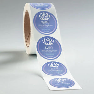
Open Sans. Open Sans is plain, simple, clear, and incredibly popular. The professional crispness and legibility make this a perfect font for small text on “everyday” brands. Certainly, a font to keep in your back pocket.

Helvetica. Helvetica is bold, strong, and has a modern look to it that’s ideal for showing off revolutionary, new products. Helvetica was specifically crafted for signage, which is why it works so well with large labels, advertisements, flyers, and just about anything that needs a nice, clear, neutral tone.

Arial. Arial is one of the most prominent fonts on the web, and for obvious reasons. It offers stark clarity even when you’re looking at small letters on a screen. That said, Arial uses “mirrored character,” meaning symbols like q and p are mirror images of the same shape. While that makes the font more consistent, it can sometimes cause issues for customers with reading disorders.
8 Creative Fonts for Stickers
Depending on the type of brand identity you want to create, there are a series of creative fonts that will help share the voice, personality, and vibe of your brand. Here are a few of our favorite creative fonts to use when designing a custom sticker:
- Candyhouse
- Claudria
- Tastify
- Oh! Sweet Nuthin'
- Boldwell
- Bubble Boom
- Notice Things
- Hiatus Brush
Let's take a closer look at each creative font.
1. Candyhouse
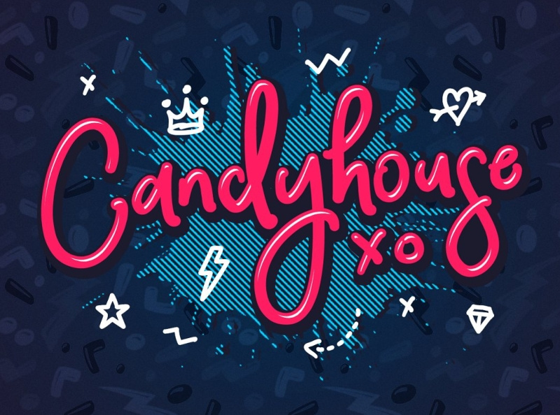
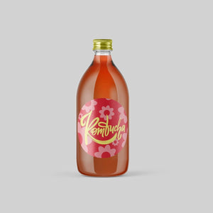
Candyhouse is a fun and playful font that is perfect for creating stickers with a whimsical and lighthearted feel. Its thick, rounded letters are reminiscent of candy and sweets, making it a great choice for designs related to desserts, parties, or children's themes.
2. Claudira
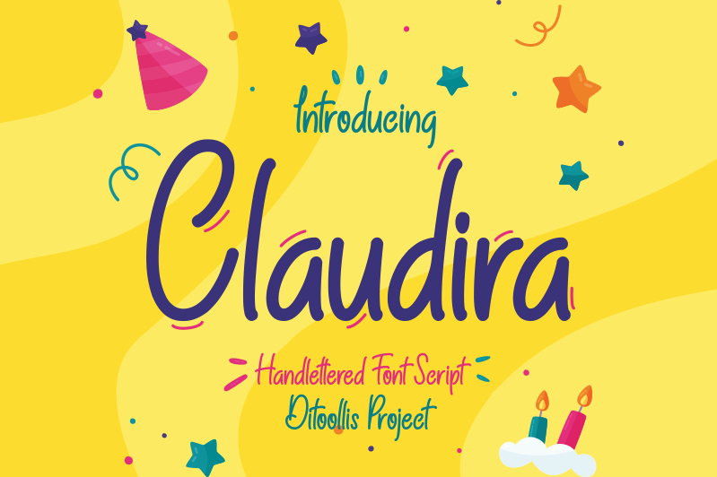
Claudria is a very bouncy and playful font that is great for youthful and lighthearted brands. It's simple yet eye-catching design resembles the handwriting of a child, with each letter featuring slight curves that lend an air of excitement to the font.
3. Tastify
Tastify is a relaxed font with a playful touch that makes it a suitable choice for creative businesses, craft food companies, or salons looking to design custom stickers. Consider using Tastify font to infuse your designs with a lively and unique personality.
4. Oh! Sweet Nuthin'

Oh! Sweet Nuthin' is a distinctive font that offers a retro, hand-drawn feel, that is in all-caps and has irregular lines and rough edges, giving it a unique and authentic look. The font's quirky style is perfect for vintage-inspired designs, posters, or logos.
5. Boldwell

Boldwell font is quite like the name suggests, bold. This font features a modern and versatile sans-serif font that is characterized by its bold and robust design. Whether you're creating a sleek and professional design or a bold and edgy one, Boldwell is a font that can help you achieve your vision.
6. Bubble Boom
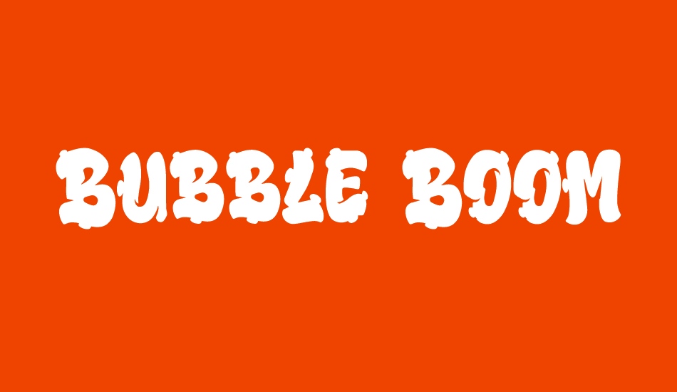
Bubble Boom is a graffiti-style font that features thick, bubbly letters that give off a friendly and lighthearted vibe. Bubble Boom is a perfect font for brands targeting a younger audience, such as children's products or candy companies.
7. Notice Things
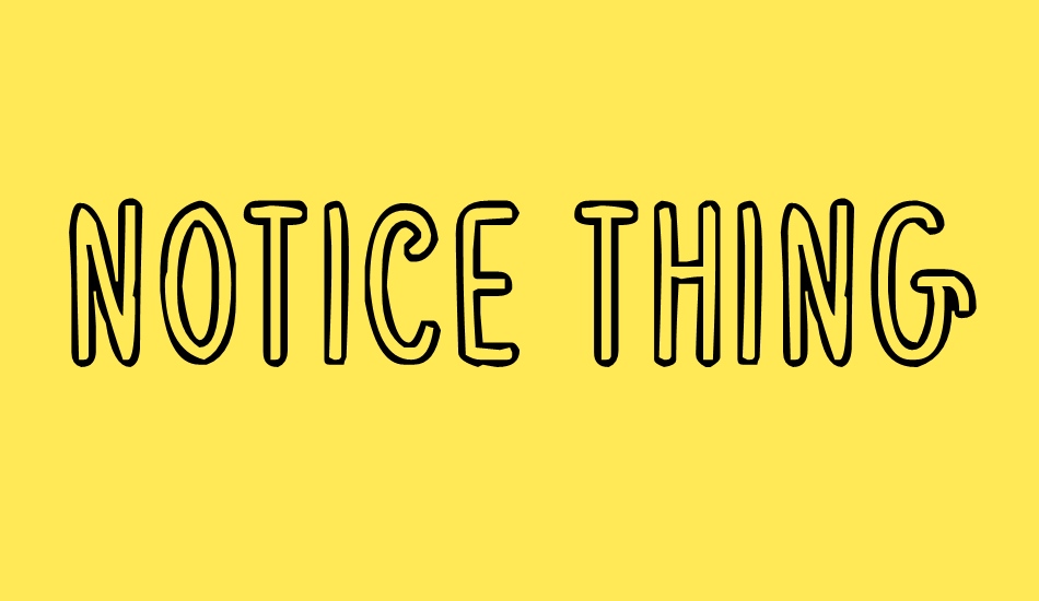
Notice Things font is best suited for short text or messages since the interior of the letters are transparent, but when used in combination with suitable visuals, it can create an impactful sticker design.
8. Hiatus Brush
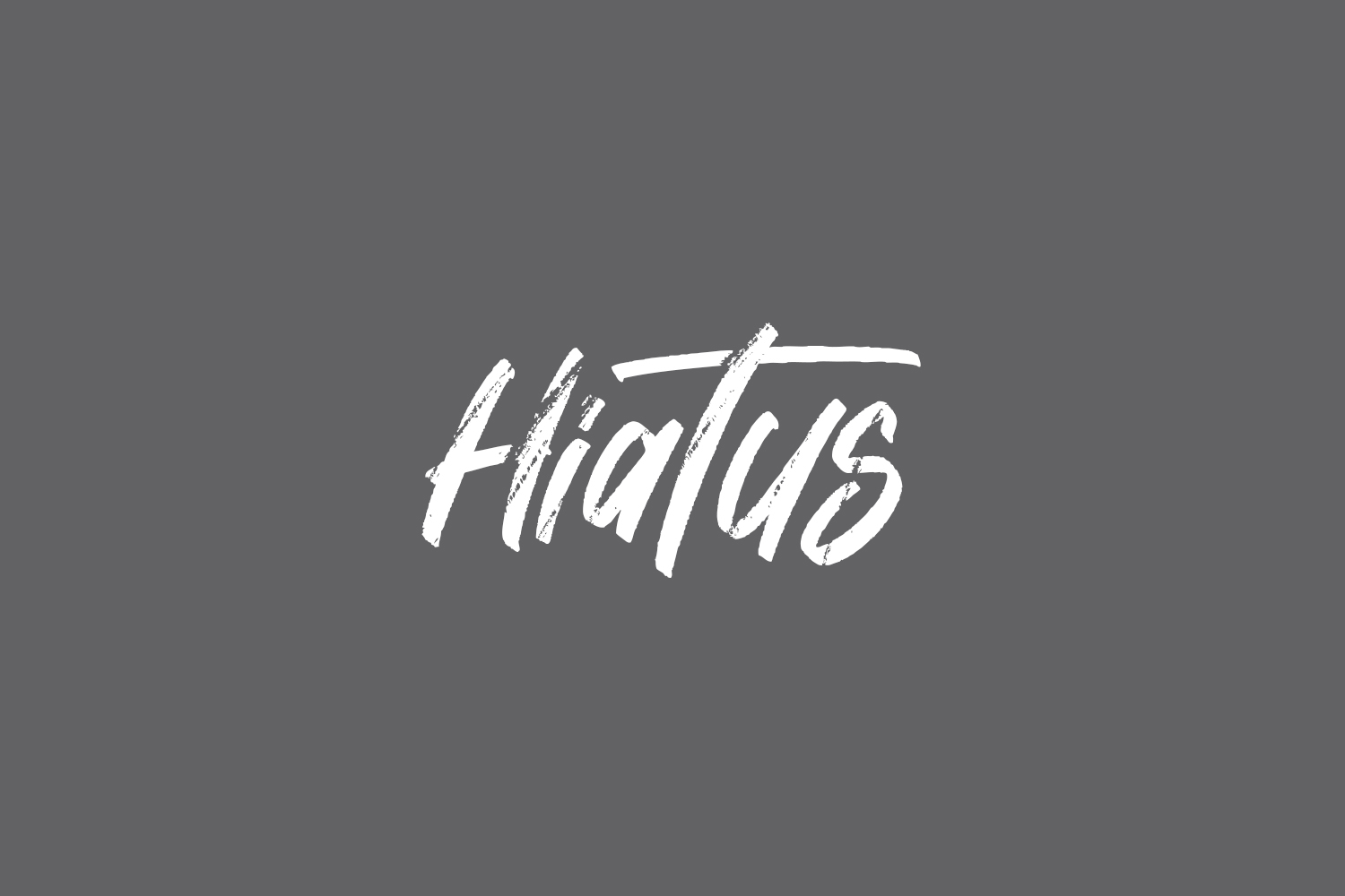
The Hiatus Brush font style would be fitting for a horror movie or punk band sticker due to its overall appearance, which exudes a gothic and ominous vibe. The uneven lines at the bottom of the letters give an impression of blood dripping, further enhancing its dark aesthetic. However, this font style may not be suitable for visuals with a playful or light-hearted tone, and it is recommended to use it sparingly.
Making the Most of Your Fonts
These fonts are tried and true, a good starting place—but they may not be your final destination. Choosing a font style is just the beginning, you also need to consider the other elements that make for cohesive branding.
Going Bold
Bold can make a higher impact, but it can also make the font appear “busier,” which can impact its legibility. If you go bold, you may want to increase letter spacing.
Color In the Lines
Take Coca-Cola’s classic white over red. A good color combination can inspire your appetite (McDonald’s and Coca-Cola) or suggest a more modern tone (think of Apple black-and-white-and-gray themes). Remember to choose contrasting colors; in fact alcohol labels require it. Contrasting colors will help your text stand out against the background texture, making it easier for customers to read.
It’s Elementary Design
Whether you want one letter to extend into graphic design elements like arrows or circles—or if you prefer a clean, minimalistic look—every choice will impact how people perceive your brand. Be clear about the elements of design you choose to incorporate and make sure you can justify every choice.
Of course, all that work will go to waste if you don’t put your new design to use. Stomp’s nifty design tool and near-instant proofs will make sure your custom labels are the best around.
Label Font FAQs
What are the Best Fonts for Name Tags?
The best fonts for name tags are ones that are easy to read from a distance, including Gotham, Arial, Myriad Pro, Helvetica, or Futura. It’s best to avoid using any cursive, serif, or italic fonts for name tags.
What is the Most Legible Font for Small Print?
If you’re printing on business cards, menus, appointment cards, or any other small product that requires small print, it’s best to use a font like Helvetica since it features tall thin letters that make it easy to do more with a small amount of space without compromising legibility.
What Are the Different Types of Display Fonts?
There are a variety of different types of display fonts. The most common ones include slab serif, script font, reverse-contrast and sans serif.
What Are the Four Main Types of Fonts?
The four main types of fonts include Serif fonts, Script fonts, Sans serif fonts, and Display fonts.
- Nashira Edmiston